Reporting for Everyone – Create accessible Power BI reports in just a few steps
This post is also available in:
![]() German
German
An overlooked, but even more important topic in IT in general, but also in the area of business intelligence, is to make programs, or in our case reports, accessible to as many people as possible.
What are the different types of barriers?
Although there are other barriers, we will focus primarily on two areas. On the one hand visual, on the other hand physical limitations.
Visual limitations
When it comes to visual limitations, many people first think of blindness. However, there are significantly more types of visual limitation. Probably the most common is the red-green color blindness, which is estimated to affect nearly 10% of all people. There are also other limitations, such as problems with low-contrast content or limited ability to see.
People who have problems in these areas can definitely be helped. Be it with a conscious choice of colors and high-contrast combinations. But also screen readers can help affected persons by reading the particular content to them.
Physical limitations
In addition to visual impairment, physical limitation is also common. These can be fine motor disorders or have a disease-related cause and simply mean that people have problems guiding a mouse with appropriate sensitivity. There are alternative navigation options here as well. Besides special hardware, the simplest alternative is often a normal keyboard. For example, most programs can be operated extremely well with shortcuts and navigation options via Tab and Enter key.
What possibilities does Power BI offer
Visual limitations
First, I’d like to look at the visual display improvements. One is a better color choice, which can help with different types of visualization problems. For this purpose, it is usually sufficient to look at one’s own report again “through the eyes” of a person with corresponding limitations. For this purpose, there are Chrome and Edge plugins with which you can view a website and therefore a published report with an appropriate filter. A few plugins would be for example:
For the problem with contrast, one approach is either to choose colors that are as high in contrast as possible and to avoid sometimes fancy, but low-contrast combinations like a dark gray on top of a light gray.
There is also the possibility to change the theme. For example, Power BI already offers high contrast themes by default, and themes for people with color blindness:
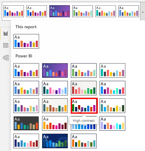
Generally, the main colors should be tested in advance with a contrast checker. Here, for example, the following website can help:
Accessible Colors | WCAG 2.0 AA and AAA color contrast checker (accessible-colors.com)
Also, never rely entirely on color as the only indicator of a visual. Always add this information in another way, for example with an arrow or text!
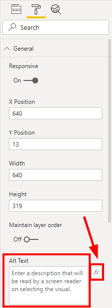
When users have major problems with vision, they often use a screen reader. It reads out the contents of the individual visuals, so that the end user has the possibility to receive more information here than is visible at first glance. The field for the screen reader is available for every visual and can be found under the “General” tab as “Alt Text”. This can be filled statically, but also dynamically with a DAX Measure. This allows the content to be adjusted to the current filter context. This means that if May to September 2021 is selected as a slicer, this can also be set up as an Alt Text via DAX Measure. The screen reader would read out the relevant information accordingly.
The alternative text and the function to use a measure as alternative text can be found under the General tab of each visual and should always be filled:
Physical limitations
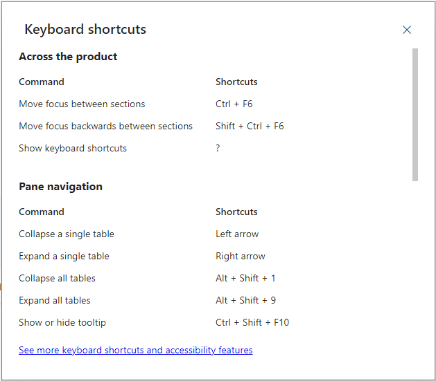
For people with physical limitations, there is an option to operate Power BI using only the keyboard. This only requires a few shortcuts, which can be displayed by clicking on the question mark button on the keyboard:
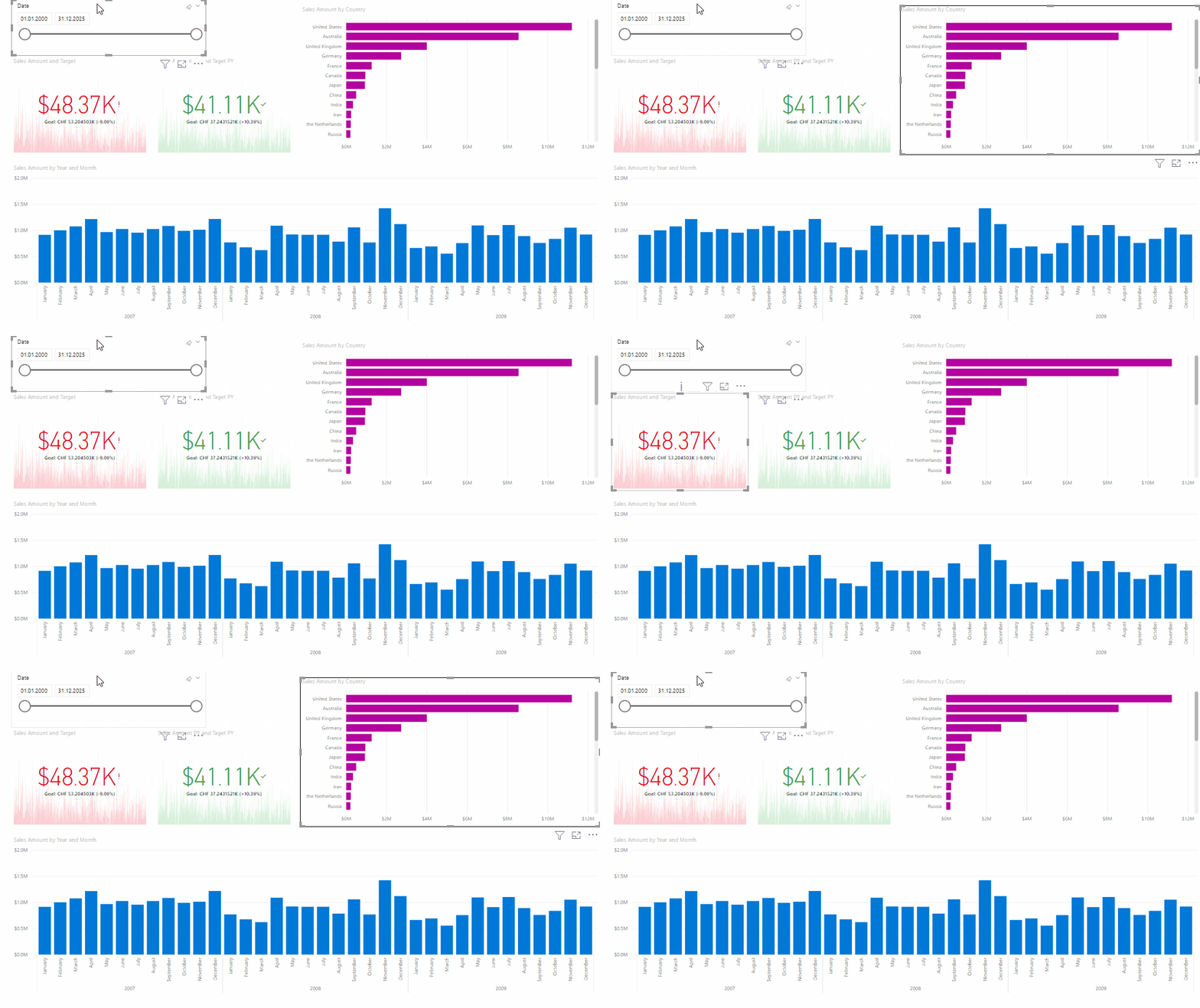
Alternatively, in Power BI you can navigate between the individual visuals in the report simply by using the Tab key. Also, reports can be navigated, selected and filtered completely without the mouse using Enter, Escape, the space bar and the arrow keys. This can then look like that:
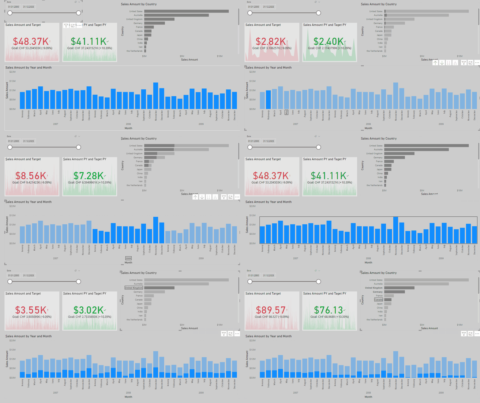
What stands out in the example shown above? The navigation order is absolutely random and useless. To make it as easy as possible for the report user, exactly this order can be defined. Using the tab order in the selection area, we can manually define the order in which the tabs are accessed:
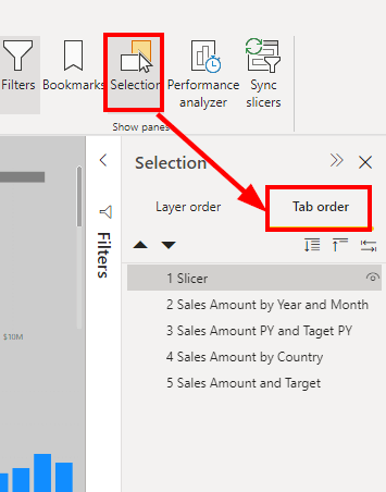
What else stands out? The color choice is absolutely unfortunate. There is little contrast in places with gray on gray and black text. The KPIs are kept in red-green, which is the only information about the status of the KPI. This should be strongly avoided.
This can be improved very easily. Just a better color choice and a correct sorting of the tab order improves the accessibility a lot. With changes that can be made in a few minutes, we have already significantly improved the report:
What should not be missing from any report?
Nowadays, accessible reports are no longer a minor issue, but more relevant than ever. With the possibilities that Power BI offers us, there is no longer any reason not to create accessible reports. From my point of view, the basic principles should be taken into account in every report as a reporting standard:
- Set the tab order to allow meaningful navigation with the keyboard
- Maintain the alternate text field for all visuals to provide the best possible user experience for people with screen readers
- Make the design of the report high-contrast and define colors in such a way that the reports are as easy to recognize as possible especially for people with color deficiencies. When testing the report, be sure to use filters for the most common color weaknesses and check the contrasts of the main colors.
- Avoid colors as the only indicator. Always add that information with an icon or text. Follow the International Business Communication Standards (IBCS) for meaningful reporting.
Conclusion
Making reports accessible does not require a lot of extra effort. With the measures from the last section, a report can be designed to a very high degree of accessibility with minimal time investment. I think it is the responsibility of every company to get more out of reporting by default and to make the reports available to as many users as possible in an appropriate form.
Learn more about accessible reports in the official doc:
https://docs.microsoft.com/power-bi/create-reports/desktop-accessibility-overview
