Display DAX Measures in a Matrix on Rows
This post is also available in:
![]() German
German
Update March 2022: Screenshot of the new format pane added
Measures are the best way to calculate your key figures in Power BI. In a matrix, however, these can normally only be displayed as values and not at row or column level. However, sometimes you need them exactly at the row level.
Display contribution margin calculation at row level
An example I came across recently was the presentation of a contribution margin calculation. The individual items should be displayed below each other at row level. The default view, when displaying only the Measures, is horizontally aligned:

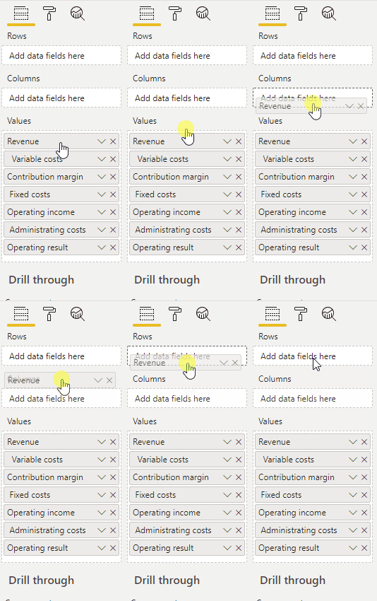
Even if you explicitly drag the measures onto the rows, they cannot be displayed at row level:

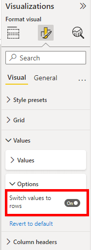
There is, however, an option which is rather unknown, but which makes this possible very easily: the option “Show on rows” in the Matrix Visual:

In the new format pane you will find the option in the following spot:

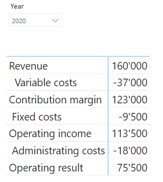
As soon as this option is activated, the measures are automatically displayed on the X-axis:

In my example, the use of custom visuals was not allowed. Otherwise, there are some other options as an alternative.
